| Reserved for Commands |
The area reserved for Commands. The size and format of the Command buttons are configured in Miscellaneous > General > Screen Layout (Commands) > Command Ribbon Button Options. Note: If the Canvas Level is set to “Modifier” the Reserved for Commands area will not be displayed. |
| Reserved for Canvases |
The area reserved for Canvases. The size and format of the Canvas buttons are configured in Miscellaneous > General > Screen Layout > Canvas Ribbon Button Options. Note: If the Canvas Level is set to “Modifier” the Reserved for Canvas area will not be displayed. |
| Guest Check |
The area reserved for the Guest Check. The size and format of the Guest Check is configured in Miscellaneous > General > Screen Layout > Check Options.
|
| Canvas |
The area reserved for Canvas Items. If “Automatic” is displayed in the Canvas Inspector the Canvas cannot be modified.
| Adding Canvas Items |
Procedure to add A Canvas Item
- Right-click the mouse on a blank area of the Canvas.
- Select the Canvas Item Type (Menu Item, Payment, Picture, Label, Table, Order Type, Package, Discount, Quantity, Command and Report).
- Click on the Canvas to create the new Canvas Item.
|
| Selecting Canvas Items |
| Shift Key |
A Canvas Item may be selected by clicking it. To select multiple Canvas Items, hold the Shift Key down and click the desired Canvas Items. |
| Lasso Canvas Items |
Drag the lasso around the desired Canvas Items to lasso multiple Items. |
|
| Sizing |
A Canvas Item may be manually resized by dragging the edge to the desired size. Hint: The size of a Canvas Item may be increased or decreased by one pixel by pressing the Ctrl Key along with the Left Arrow Key or Right Arrow Key respectively. |
| Moving Canvas Items |
A Canvas Item may be moved by dragging the selected Canvas Item to the desired location. Hint: A Canvas Item may be moved one pixel in any direction by pressing the Shift Key along with the corresponding Arrow Key respectively. |
|
| Canvas Inspector |
Restrictions
The Canvas Inspector is used to configure up to 150 Canvas Items.
Note: The specific fields that may be edited depend on the type and number of canvas items that are selected. If multiple Canvas Items are selected and they are of different types (i.e., Menu Items and Pictures) then the only attributes that may be edited are: Top, Left, Width, and Height. If the value of a Canvas Item field is the same for all of the selected Canvas Items then it is displayed, otherwise it is left blank or zero to indicate that the selected items have different values.
| Field |
Description |
| Canvas |
Canvases that are configured in Menu > Canvases.
|
| Type |
The Type of the currently selected Canvas Item. Note: If multiple Canvas Items are selected then “None” is displayed. |
| Canvas Item |
The number of the currently selected Canvas Item. Note: If multiple Canvas Items are selected then “None” is displayed. |
| Automatic |
“Automatic” is displayed on the Canvas Inspector if the Canvas type is set to Automatic. |
Item  |
The Menu Item, Payment, Discount, Command, Order Type, Table, Package or Report for the currently selected Canvas Item. Note: If multiple Canvas Items are selected, then the Item drop-down list is not displayed. |
| Top |
The number of pixels from the top of the Canvas to the top of the Canvas Item. |
| Left |
The number of pixels from the left side of the Canvas to the left side of the Canvas Item. |
| Height |
The height of the Canvas Item in pixels. |
| Width |
The width of the Canvas Item in pixels. |
Format  |
The Screen Format for the Canvas Item. The Format defaults to the Canvas Item Screen Format for the current Canvas. The Screen Format is set to the Format of the first selected Canvas Item when multiple Canvas Items are selected. Note: The Format is not available when a Table Type Canvas Item is selected. |
| Lock |
| True |
The Canvas Item position will not change when Sorted. |
| False |
The Canvas Item position will change when Sorted. |
|

|
The Add function adds a Canvas Item. Note: The Add function may also be accessed by right-clicking the Canvas area.
| Menu Item |
A Menu Item will be placed on the Canvas. See Video: How to Add a Menu Item. |
| Payment |
A Payment will be placed on the Canvas. |
| Picture |
An Image will be placed on the Canvas.
| Image |
The Image to be displayed. |
|
| Label |
A Label will be placed on the Canvas.
| Caption |
The Caption to be displayed, up to 15 alphanumeric characters. Note: The macro %T may be placed in the caption to display the current time. |
|
| Table |
A Table will be placed on the Canvas.
| Caption |
The Table Number, up to 15 alphanumeric characters. |
|
| Order Type |
An Order Type will be placed on the Canvas. |
| Package |
A Package will be placed on the Canvas. |
| Discount |
A Discount will be placed on the Canvas. |
| Quantity |
A Quantity will be placed on the Canvas.
| Quantity |
The number of items to be ordered. |
|
| Command |
A Command will be placed on the Canvas. |
| Report |
A Report will be placed on the Canvas. |
|

|
Deletes the currently selected Canvas Item(s). |

|
Copies the currently selected Canvas Item(s). |

|
Pastes the previously copied Canvas Item(s) to the current Canvas. Note: Items retain the same position when copied from one Canvas to another. |

|
Align is used to line up Canvas Items. Multiple Canvas Items are aligned by selecting an ‘anchor’ Canvas Item and then, while holding down the Shift key, selecting all other Canvas Items to be aligned with the ‘anchor’. If the Anchor is de-selected, then no alignment will occur.
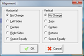
| Horizontal |
| No Change |
Will not make any changes to the horizontal alignment. |
| Left Sides |
Aligns the left side of the selected Canvas Items. |
| Centers |
Aligns the centers of the selected Canvas Items. |
| Right Sides |
Aligns the right side of the selected Canvas Items. |
| Space Equally |
Spaces the selected Canvas Items evenly, starting from the horizontal center of each Canvas Item. |
|
| Vertical |
| No Change |
Will not make any changes to the vertical alignment |
| Tops |
Aligns the tops of the selected Canvas Items. |
| Centers |
Aligns the centers of the selected Canvas Items. |
| Bottoms |
Aligns the bottoms of the selected Canvas Items. |
| Space Equally |
Spaces the selected Canvas Items evenly, starting from the vertical center of each Canvas Item. |
|
|

|
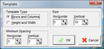
Template is used to specify Menu Item characteristics such as height, width and spacing for a Canvas. Templates are an easy way to create multiple Menu Items that are already aligned on a Canvas.
| Template Type |
| Rows and Columns |
| Size |
| Horizontal |
The number of columns. |
| Vertical |
The number of rows. |
|
|
| Height and Width |
| Size |
| Horizontal |
The width of the Menu Item buttons in pixels. |
| Vertical |
The height of the Menu Item buttons in pixels. |
|
|
|
| Minimum Spacing |
| Horizontal |
The minimum number of pixels between the columns of Menu Item buttons. |
| Vertical |
The minimum number of pixels between the rows of Menu Item buttons. |
|
|
 Cancel Cancel |
Cancels the Add function. |

|
Sorts Menu Items and Packages based on the Canvas Sort settings. Note: Menu Items that are Locked will not be sorted. |

|
Saves the work in progress. |

|
Exits the Canvas Designer without saving. |
|
 button to the right of a field will display the respective configuration window.
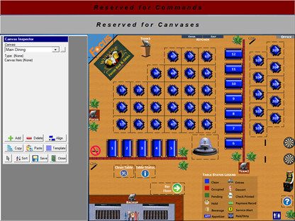
 .
.